
Many landing pages look great, but they don’t convert.
After working with more than 20+ SaaS founders, I’ve realized that many prioritize the wrong elements or entirely miss out on certain sections.
This article is for you if:
(1) You’re not sure what to include on your page
(2) You are trying to optimize your conversion rate (CRO)
If you’re ready, let’s begin.
Section 1: Hero
What it’s for
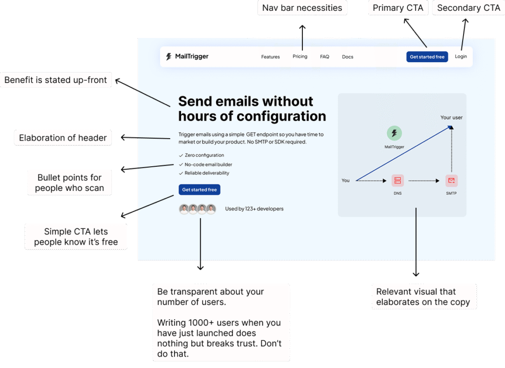
Also known as above-the-fold, your users see this section when they land on your page. You need to accomplish 3 things to make sure they continue scrolling:
(1) Your copy should clearly explain how you can help them
(2) Your section should build trust
(3) Any visual should be used to help visualize your product, not just to ‘look good’
Example of a Hero section
Section 2: Pain point
What it’s for
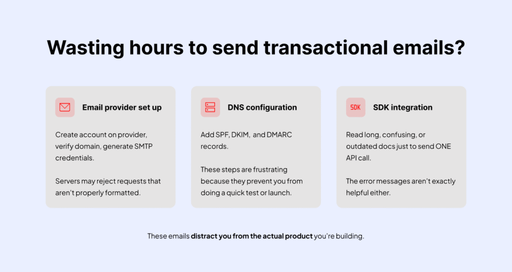
Others may use a Before/After section or a ‘Transformation’ section instead. Use this space to build rapport, show your visitors you know their problems, and how you can help them. Accomplish these 2 things to make sure they are ‘locked in’:
(1) Share 1-3 problems they face
(2) Picture the consequences of these problems
Example of a Pain point section
Section 3: How it works
What it’s for
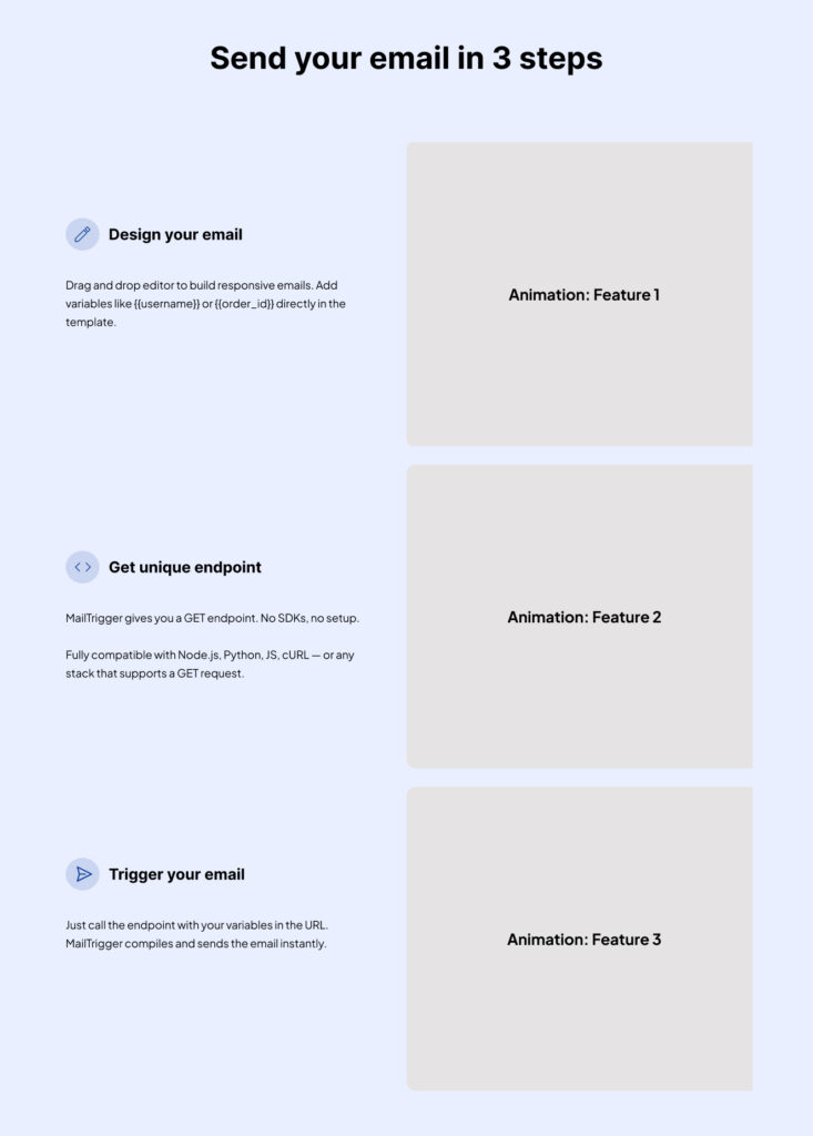
Let your visitors understand how they can start using your tool. It’s best if you can show it in 3 steps. You can show it in a single row for desktop mode.
Example of a ‘How it works’ section
Section 4: Features
What it’s for
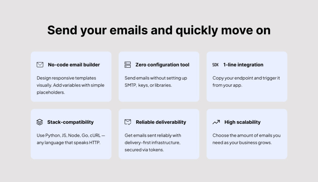
Once you’ve gotten your visitors interested, they’ll want to know the features you have. There are many ways to do it (look at the example below). Another way is to have a separate section for each feature (like the example in Section 3)
Depending on how complex each feature is, you might need to have a ‘Learn more’ button in each container. The learn more button leads to another page which explains more about the specific feature.
Example of a ‘Features’ section
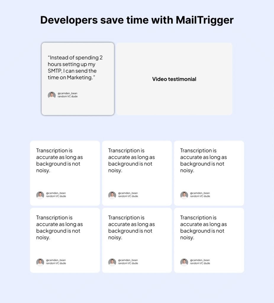
Section 5: Social proof
What it’s for
Here’s where many founders stuff in fake testimonials and reviews. But doing that will only hurt your credibility, because your visitors aren’t dumb. If you’ve just launched on X, and your users come from X, you’ll lose their trust immediately. Take time to speak to 5 users, and get their written feedback and the link to their reviews.
5 genuine testimonials > 50 fake ones
You can also put the hyperlinks to the actual review or testimonial. Even a link to an X (previously Twitter) comment builds credibility.
Example of a ‘Social proof’ section
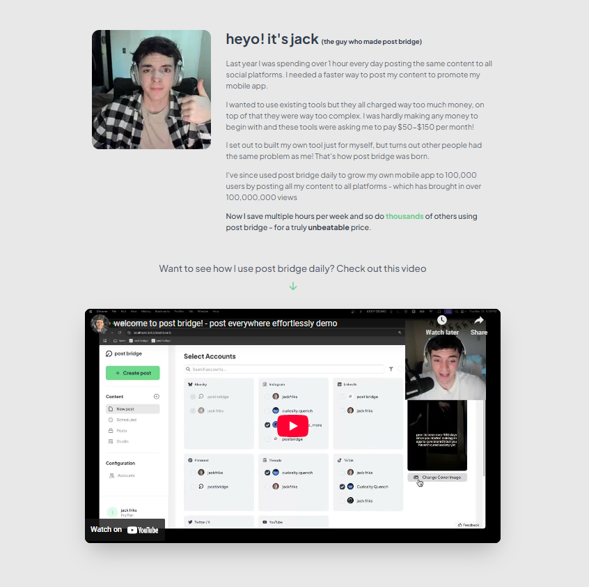
Section 6: Founder’s story + demo
What it’s for
Use this section to build rapport with your visitors. Share the story behind this product, and what problem you’re solving.
Include a short demo video that’s 60 seconds or less, and focus on 3 main features of your product. Keeping it less than 60 seconds also makes it easier for you to hold your visitors’ attention.
The example below is from Jack Friks, the guy who made Post Bridge. I like it because it’s authentic, and the demo video (with his face) shows me he is invested in this product too.
Example of a ‘Founder’s story + Demo’ section
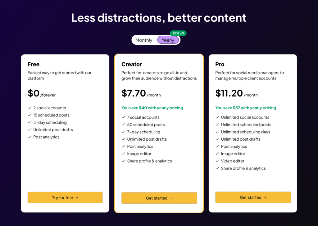
Section 7: Pricing
What it’s for:
Share what features your visitors can get in each pricing tier and how much it costs. It might be better to charge using a pay-by-usage model, depending on what your product is. For instance, if your product is an AI thumbnail generator, then charging by credits (volume) might make better sense.
Include an annual payment option, highlighting how much they can save.
Example of a Pricing section
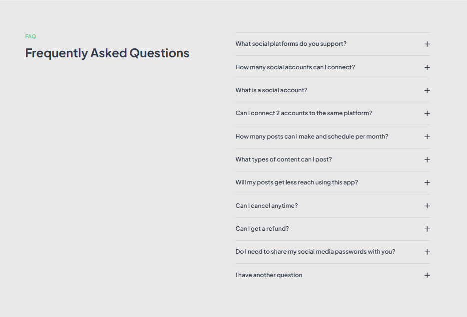
Section 8: FAQ
What it’s for
Use this section to put in any questions related to your SaaS. Having this section helps you make sure visitors aren’t confused about your product (trial, usage, billing, restrictions).
Also, include a “My question is not listed here” FAQ, and share your customer support email link there.
Example of a FAQ section
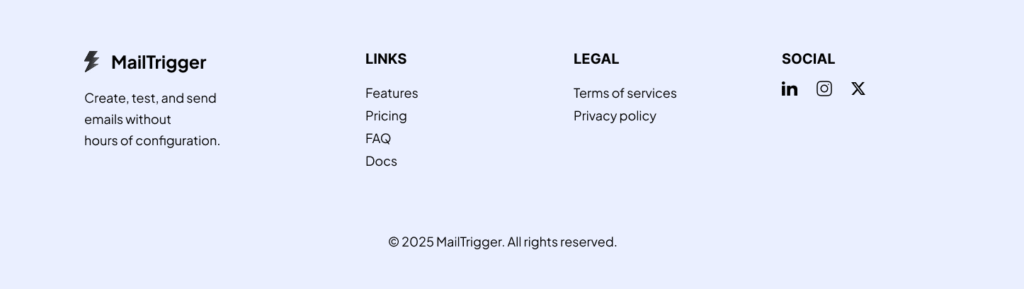
Section 9: Footer
What it’s for
Include navigation, legal, and social links. Just create a simple footer, and spend time optimizing the copy in your other sections instead.
Example of a Footer section
Conclusion
There you have it! The 9 important sections for a high-converting landing page. I hope you found value in it.
If you’d like me to write your page instead, you can click here to book a discovery call.